Welcome to the Demo Component Page
Hi Team,
Welcome to the Demo Component Type Page with Table of Contents. This page will display the variety of component types and have explanations of how to use each, what options to adjust, and more.
This is a Rich Text Editor.
When editing, you will see tabs for:
- Header (the title you see above)
- Content (this information)
- Footer (which is really a button)
- Design Options
In the main content area, you'll be able to style content in a few ways.
- This is a numbered list
- Above was a bulleted list.
- You can add hyperlinks.
You can also style items like the pull quote below:
MS Canada is a great organization to work for. Your colleagues are smart and the work is important.
Additionally, you have the option to make copy a button. You first have to write a string of copy. Then make that a hyperlink. Then you highlight the hyperlink and in the "Style" dropdown you can click on "buttonize link."
Finally, you have the option to do standard rich text styling like add different sized headings and bold or italicize your copy.
Heading 2 is a good for titles.
Heading 3 for subtitles.
Heading 4 for section call outs.
Heading 5 for smaller section call outs.
Heading 6 is just a step above standard copy.
Headings do have an implication on SEO and Accessibility. You want to make sure you're using them in an ordered, appropriate way.
Info Block
Below you will see 3 examples of Info Blocks. These components have a handful of options so I wanted to show a variety of displays for these components. Within each Info Block, the copy will explain the changes.

Info Block - Defaults
This is an Info Block with all default settings.
Under Admin Info: Set the layout (image can be on right or left; this is image left).
Under Header: Write the title.
Under Content: Set the Text Width (default or wide; this is default). Then add the copy you want in this section to the Rich Text Editor (RTE). You can do bold, italicize, bulleted list, numbered list, links, pull quotes, heading styles, and more within the RTE.
Under Links: You can add links to unique content that lives on your website.
Under Media: Set the image to the style you'd like to use (Default is however the image was uploaded / Alt Rounded is half round, half square / Circle is a circle). Connect the image you'd like to use.
Left Image, Text Width Wide, Image Alt Rounded
This info block is
- Left Image
- Text Width Wide
- Image Alt Rounded
- Has Links (bulleted below)
You can see the links here:
Info Block, Right Image, Text Width Wide
- Image right.
- Text Width is Wide. The component will be the same width, but the text area is wider than default.
- This does not have links attached.
- Image is Circle

Related Links Wrapper - Curated
This next component is Related Links Wrapper - Curated. These display as four blocks with different colors. You can choose four internal links to connect to that fit the tone/user journey of the page you're creating.
You will have the option to have the short description show or not show. The following Related Links Wrapper - Curated has short descriptions turned off.
Related Links Wrapper - Curated + Short Description
This next Related Links Wrapper - Curated shows short descriptions.
We recommend showing the short description show when you have content that needs extra clarification.
- Where is the user going?
- The short description dynamically pulls from the internal resource's TEASER section.
- It is not editable within the component.
- If you want the short description to show, you should go to the page you are linking to, and make sure the short description under the Teaser tab is correct.
Related Links Wrapper - Automatic
This next component is a Related Links Wrapper - Automatic. These will display as four blocks with different colors. It will automatically link to internal resources based on the area designated for this page.
Promo Blocks
This next component is a Promo Block. These are great for CTAs, linking to webinars, resources, events, and other relevant content that you want to highlight or encourage your visitors to use.
This is a promo content type. You should add a title, a short description, a url + the copy to display on the button.
You can add an image, as seen here. We don't recommend touching the Design Options for this component.

This is a promo content type. You should add a title, a short description, a url + the copy to display on the button.
You don't have to add an image, like this one. We don't recommend touching the Design Options for this component.
Testimonials
This next component is a testimonial. Use these to add a human element to your content and further the feeling of community you are trying to bring to your online ecosystem.
- You have the option to at as many as you like. We recommend sticking to either 1 or 3 in a slider. The first example below has 1, the second has 3 in a slider.
- We recommend keeping the image to the left, even though you have the option to have it to the right. If you are doing a slider, definitely keep the image on the same side on all of the slides.
- You do not need to include quotation marks in the Quote field.

QuoteThe real win here is consistency. Every component behaves the same way, which makes the whole system easier to design, build, and maintain.

QuoteOnce we started thinking in components instead of pages, everything clicked. Building new layouts became faster, cleaner, and way less stressful.

QuoteThese blocks make it easy to focus on content without worrying about spacing, alignment, or breaking the layout. Drop it in, add copy, done.
QuoteThe real win here is consistency. Every component behaves the same way, which makes the whole system easier to design, build, and maintain.
Media - Video
Below you can see a Media element incorporated into the content. This is a YouTube video.
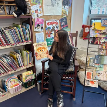
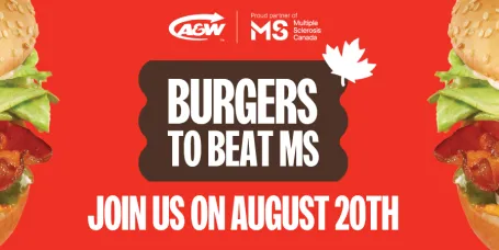
Media - Image
Below you can see a Media element incorporated into the content. This is an image. You can always use RTEs (like this one) to explain images or add context to your media elements.

From Library
The next section shows components you have available. These elements are reusable. They are NOT created on an individual page. You must go to Content > Paragraphs to create a new Reusable Component. (Paragraphs is a legacy term in web development. Paragraphs = Blocks = Components).
Once you create a Reusable Component you can place that same component on multiple pages. If you edit it, it will update across all the pages you've placed it on. A good use case is a Promo - you can create a promo for a campaign, leave it be for a month while the campaign is running, then update it to a new campaign - it will update across all the pages.
At the moment (Feb 2026), the main From Library component you will want to incorporate on pages is the Donation component. Below, I placed it on the page, but I cannot edit the copy or link of the Donate button.

Community Promo
Community Promo
Donate to MS Canada
We still have many unanswered questions about MS. Together we can uncover the knowledge we need to create a world free of MS.
Curated Cards - 2 Columns
These are curated cards "Existing" cards. In order for these to appear properly, on the individual content items, you need to add TEASER and MEDIA information.
When you have a TOC on the left side of the page, we recommend that under Design Options > Grid you choose 1 or 2 columns. The following is 2 columns.

Curated Cards - 1 Column
When you have a TOC on the left side of the page, we recommend that under Design Options > Grid you choose 1 or 2 columns. The following is one column.


Curated Cards - Custom
These are curated cards - custom. I created all the cards right here and now on this page. They do not exist other than here on this page. It usually is more ideal to make sure the pages you create have the image, short description, and all information created for the TEASER, so you don't have to create cards on an individual basis.


1:1 Peer Support
The 1:1 Peer Support Program is a telephone and internet-based program for individuals living with MS and for loved ones of people with MS.

Quality of Life Program
The Quality of Life Program provides practical assistance to people, helping them access equipment & assistive technology that promotes independence
Curated Cards - Stats
This is the Curated Cards - Stats grid. It should ALWAYS be two stats side by side. If you want to add more stats, ensure it is an even number and create a new set of curated cards.
When you add "Curated Cards" to your page, you will see Insert, Heading, Footer, Design Options.
- First thing to do is under DESIGN OPTIONS, adjust the Grid to 2 columns. The rest of the items can remain as is.
- Then under the Insert Tab, click the Add Stat Card button.
- Then, click it again.
- You will now have two form areas to add in your Stat information.
Card Title should be number or small word - 9 characters maximum.
Then, in the Card Body you can add the qualifier information. We recommend keeping this brief. See the examples below.
101
Dalmatians exist in a movie somewhere
20,000
Leagues under the sea is a book
1%
Flew over the cuckoo's nest
Four
Weddings and a funeral
Curated Cards - Info Cards
These are tan cards that are used simply to break up content into more readable chunks.
Under Design Options, if you leave it entirely as is, the cards will be 3 across.
For a page WITHOUT a Table of Contents, you can adjust the grid to be a 4 Column grid. With a table of contents, you will want to limit it to 3 across or 2 across.
Beach Breaks
Unplug by the water with warm sand, ocean breezes, and slow days that leave room for rest, reading, and sunsets.
Mountain Getaways
Escape to the mountains for fresh air, scenic views, and quiet moments—perfect for hiking, relaxing, or simply recharging.
City Escapes
Explore new cities filled with great food, culture, and walkable neighborhoods, whether you’re sightseeing or blending in like a local.
Road Trip Adventures
Hit the open road and discover hidden gems along the way, with the freedom to stop, explore, and change plans as you go.
Curated Cards - Media Download Grid
This is a card where you can add media to be downloaded. This is likely one of the lesser common components you will use.


Curated Cards - Video Cards
When you want to add embedded video cards, you should select "Curated Cards" and then "Add Video Card." You will be able to add a title and a short description to each video. You can add the video from a URL or from the media library video options.
Title of Video
Additional context around the video if needed or required.

Video 2 Title
Here is more copy about this video.

Learn about MS w. Dr. John Doe, MD
Here is more context.
Carousel Promo
The following component is the Carousel Promo (default).
Items:
- Choose Carousel Embed (dynamic).
- Adjust Visible Cards to 2 (when there is a TOC), leave at 3 without a TOC.
- No need to adjust "Slide Change Delay"
- Select Upcoming Events Promo Carousel
- Display "Carousel Embed (grid) USE THIS ONE
- No Advanced Options
Header:
- You will need to add special code to "Source." Click to edit this component and copy/paste the code into the header section.
Footer:
- Add a link to Community Events.
- Link title: SEE ALL COMMUNITY EVENTS
Design Options (devs only)
- Change background to Alternative Background Color
- Add Block Class events-carousel
Upcoming Events
From educational sessions to wellness programs, fundraising events to social events, you’re sure to find something you love.

- Virtual
MS 101 – Newly Diagnosed Sessions
Learn More


- Virtual
MS Canada Learning Session:
Leveraging Volunteer Experience for Career & Personal Growth
Learn More
Leveraging Volunteer Experience for Career & Personal Growth

Accordion / FAQ
This is an accordion. It's best used for FAQs. Use accordions to reduce page length, but avoid hiding critical content.
Coming Soon!
We have a few additional components and styling elements coming soon.
- Highlights: These are purely a styling element to allow for extra content design. We recommend using them to call out important content or using them to break up long stretches of copy.
- Tan Cards: These will allow for content to be broken up into smaller chunks and called out in a special way.
More to Know
Add a Table of Contents (TOC) - Example:
Step 1 -
- On the right-hand side of your page, you will see a fixed "side-bar" that has a lot of options.
- The 5th option down is called "Table of Contents"
- Open that option and toggle ON the Table of Contents.
- This will place a yellow TOC section on your page.
Step 2 -
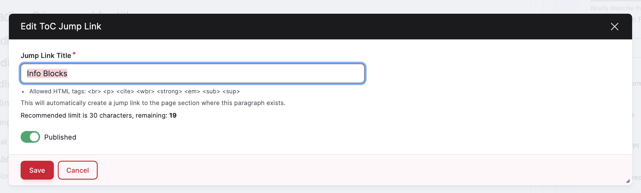
- As you build the page, you will need to add the component TOC Jump Link in the spots you want the link to go to.
- When you add that component, you will also add the Jump Link Title. This is where you will add the word(s) that you want to display in the yellow TOC on page.
- We recommend keeping these simple, clear, plain-language. You want a user who clicks on this page to quickly understand what is on the the page and where they will go if they click on the words.
Setting the Page Info:
On the right-hand side sidebar, you will see an option called Node Information. Node is another word for Page.
In this section, you will have the option to set the:
- Publish Date
- Language - Important for French language content on spcanada.ca to switch this to French
- Variant Type - it is unlikely that you will need to touch this
- Areas (see below)
- Written By - if you add an Author, it will display in the hero along with the Publish Date. This information is great to have for SEO/AEO/GEO.
- Exclude from Search Toggle - This page is excluded from search as it's an internal resource, but most of your pages you will want to avoid touching this toggle.
Your website content is grouped into various Areas that map to the primary navigation. These Areas allow different pages of content to be connected/related to each other. The Areas will help map the page you're creating to the section it is a part of. The Areas will also determine what the color of the Hero space is.
- About Us (Dark Pink)
- Find Support (Dark Blue)
- Intro to MS (Light Teal)
- Managing MS (Light Pink)
- MS Research (Yellow)
- Take Action (Dark Teal)
- N/A (Light Blue -- what this page is)